Updated October 10, 2024 | Published November 30, 2020
Shelves are too often relegated to being utilitarian pieces, but they have the potential to be much more. Knowing how to display items on your shelves isn’t always the easiest, though. That’s why we’ve put together this guide to decorating your shelves and bookcases (plus a few shelf décor ideas if you need a little inspiration).
WATCH ON YOUTUBE – 5:00
It’s a question that plagues every aspiring DIY interior designer at some point:
“How can I make my shelves look nice?”
Sure, shelves are designed to hold and organize stuff, but they also happen to be large and attention-grabbing. Because of that, shelves are an important facet of the interior design process.
Rather than using them as a dumping ground for assorted knickknacks, take a calculated approach to styling your shelves. Rather than tossing things on with no thought, think about how you can arrange your shelves for peak aesthetic appeal.
That doesn’t mean you can’t still use the shelves for storage; it just means you need to follow a few shelf décor rules.
Here’s our guide to decorating your shelves:
There are just a few things to consider before you get started with styling your shelves.
A lot of shelf styling focuses on unique pieces of artwork, photographs, figurines, or other decorative items.
But what about people who just want bookshelf ideas that involve storing… well, books?
Just because you prefer to use your shelves for book storage doesn’t mean they can’t look nice! Most of the tips in this article are aimed at decorative shelves, but they still apply to bookshelf décor—it just means a lot more of the items you use will be books.
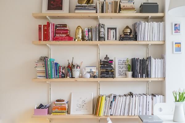
The type of shelves you’re decorating will have a big effect on how you lay out your decorations.
Wide, tall shelves with lots of open space are more challenging to style than small shelves. The extra room makes it tempting to pile more stuff onto the shelves, but all that does is make them look cluttered.
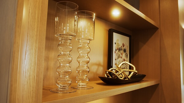
To style large shelves, you’ll need at least a few sizable items with some visual weight. Visual weight refers to how starkly the piece stands out when you step back and look at the whole shelf. For example, the glass vases in the photo below are quite large, but have very little visual weight because they’re transparent.
You can certainly still put small items on big shelves, but you’ll have to be more strategic about grouping them—more on that a bit further down.
If you’re planning to display a lot of photos, try narrow, short shelves. Photographs tend to get lost on a wide-open shelf without a little strategic layering.
But don’t worry; we’ll talk about layering too.
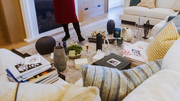
Before you start coming up with your shelf décor ideas, it’s helpful to take everything you want to display and lay it all out on the floor. This way, you can get a sense of how much you have, and start trying to sort things by size, colour, or texture.
As you’ll see when we get into the main part of shelf decorating, the size and style of your items is a big part of where you’ll place them on the shelf.
Now, on to the main event:
There aren’t many unbreakable rules for decorating shelves.
Instead, here are 12 tips you can use while you’re styling the shelves in your home. You don’t have to follow all of them, but they’ll help point you in the right direction.
You’ve laid out all the items you want to display on your shelf. How to begin?
Start by finding a place for your largest items, the ones with the most visual weight.
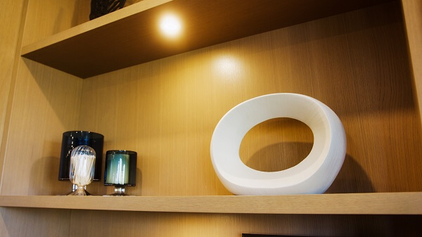
Once you’ve placed for your most prominent items, set smaller and smaller stuff until everything is in its spot.
But how do you decide what goes where?
Your shelf décor should be visually balanced.
The items you’re displaying probably come in a wide variety of sizes, colours, shapes, and textures. Try to place them so that similar items aren’t cluttered together on one side of the shelf.
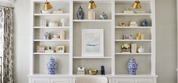
Take your largest items and spread them out evenly across your shelves, both horizontally and vertically. That doesn’t mean everything has to be perfectly symmetrical! It just means that any large items on one side should be balanced by large items on the other.
If it helps, you can imagine arranging items of roughly similar size, colour, or style in zigzag patterns:
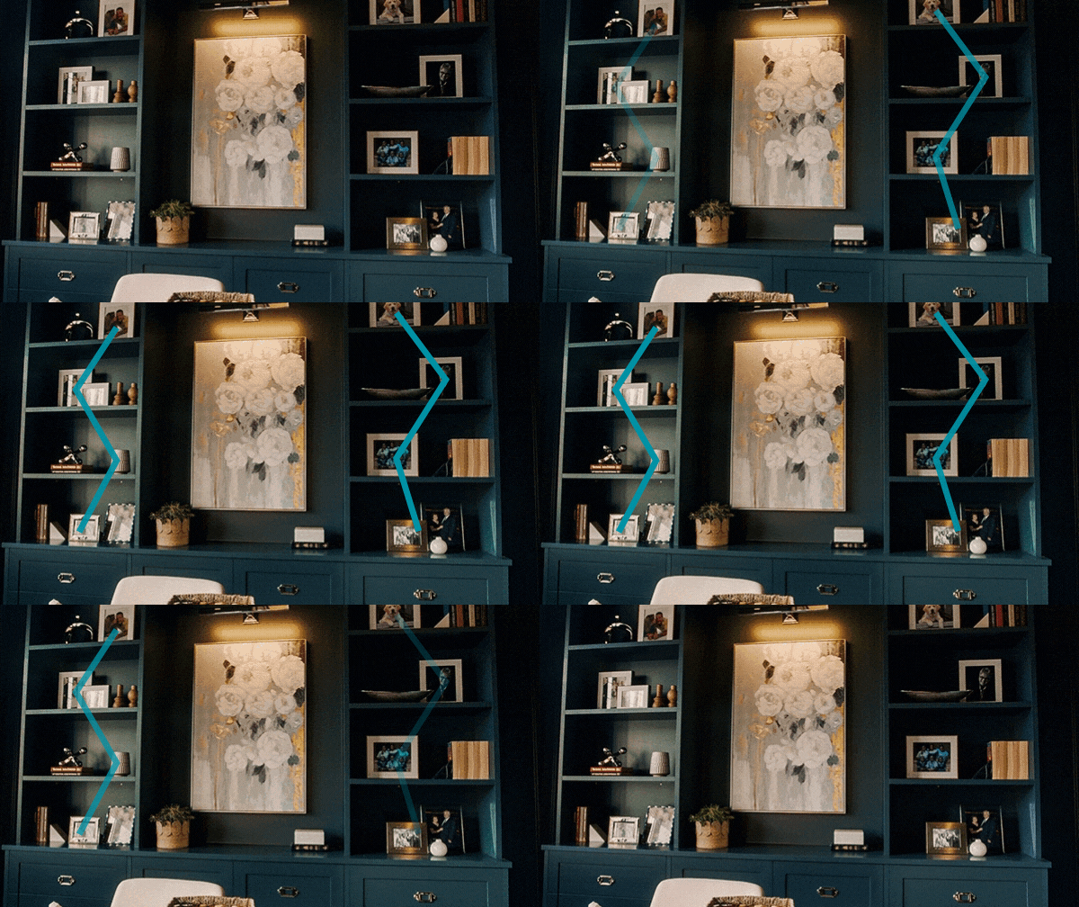
You should also balance your colours and textures this way.
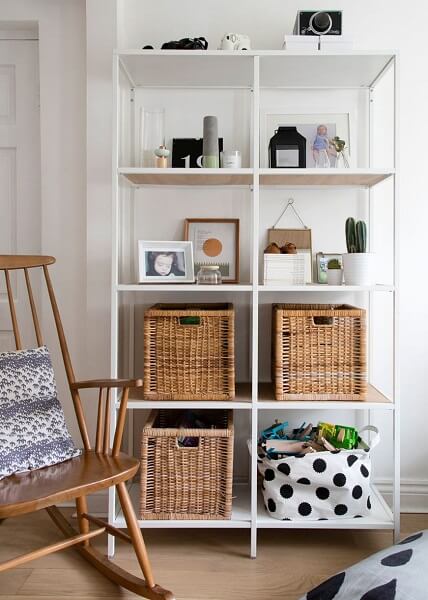
The one exception to the balance guideline would be to keep your shelf’s appearance grounded by placing the heaviest or largest items at the bottom.
Baskets or boxes, or rows of your thickest books are all candidates for the bottom shelf. In the case of boxes or baskets, they’re easier to access for storage purposes—a nice bonus.
As you’re styling your shelves, divide them into an imaginary grid of equally sized cubes.
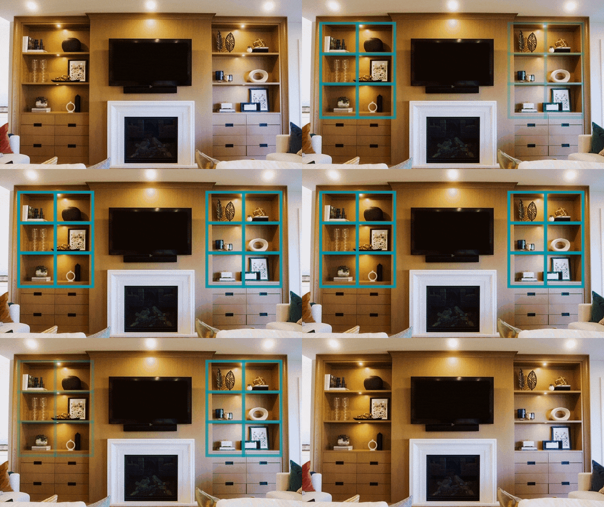
Arrange your decorations inside each imaginary cube. You can place more than one item inside each cube, but the items inside each cube should form their own little vignette.
Using the grid approach makes it much easier to keep your shelf décor balanced and organized.
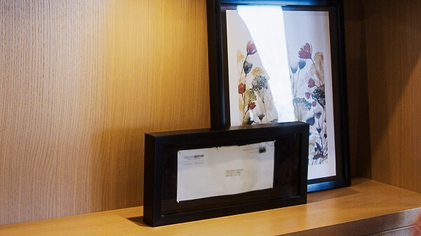
When you’re arranging several items together within one of your imaginary cubes, layer them strategically to create visual depth.
For example, a tall photograph with two shorter photographs in front often looks better than three photographs placed side by side.
You can use that approach with almost any set of objects: big in the back, smaller in the front, or a long item behind several short items.
ready for an online quote? Your time matters, and so does your stuff. Get a personalized home insurance quote in 5 minutes. That’s less time than it takes to wait in line for coffee.
Before you start, please review our Privacy Policy and Terms of Use.
If you’re styling a bookshelf, obviously you’re going to have a few books. But books play a key role in styling any shelf.
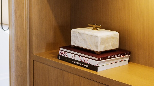
Use small stacks of 2-4 hardcover books to create a platform on which smaller items can sit and hold their own visually.
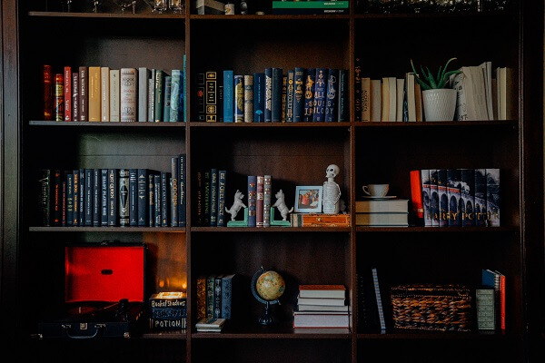
If you have many books to display, stack some vertically and some horizontally to create variance.
If your shelf is primarily a bookshelf, don’t feel like you need to adhere to a library-style alphabetical layout. Arranging books based on visual appeal sounds like heresy to many book lovers, but unless you’ve got thousands of books on your shelf, you should have no trouble finding them no matter how you’ve arranged them—and your bookshelf will look more appealing.
On that note, you don’t need to stick to just one type of item on each shelf, including books.
Say you’ve got one bookshelf and one decorative shelf in your home. It might be best (from an aesthetic perspective) to instead have two shelves that are each half books and half decorations.
By incorporating a variety of colours, textures, items, and sizes, you’ll end up with a much more visually interesting shelf.
Even a decorative shelf doesn’t have to be entirely about form over function. You can incorporate functional elements that match your overall shelf décor scheme.
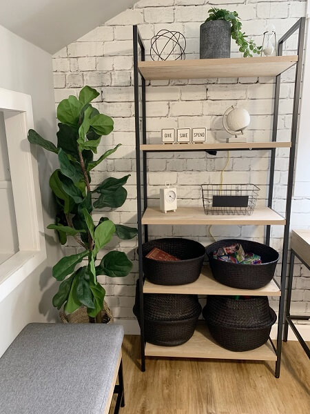
The right size and shape of boxes or baskets can hold assorted knickknacks while still looking nice, for example. Larger containers can sit on the lowest shelves and create the visual grounding that we talked about earlier.
The visual repetition of having several similar baskets or boxes also helps keep your shelf’s décor balanced.
Framed prints or other large pieces of artwork don’t have to hang from the wall.
You can place framed works of art directly on your shelves. Larger prints work great as anchoring pieces, with smaller frames or objects placed in front of them.
If putting stuff on your shelves isn’t quite enough, why not decorate the shelves directly?
Paint your shelf the same colour as the surrounding walls for a blended-in, minimalist look. Or, paint them in stark contrast to stand out.
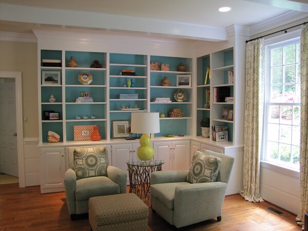
You can even use paint, wallpaper, or fabric to decorate the back wall of the shelf.
When you’re decorating a shelf in your home, you should focus on using items that you actually like.
There’s no point in styling a beautiful shelf if the result is an impersonal, generic collection that could be in a hotel lobby or a house that’s staged for the real estate market.
Decorating a shelf is your chance to tell a story about yourself. It should be like a little museum of your favourite things and memories.
If you finish decorating your shelf and you’re not happy with the result, don’t be afraid to change it up and try again.
That’s particularly true if you find your shelf looking cluttered. Less is often more when it comes to shelf décor. If you find that you’ve got too much stuff on your shelf, take a critical look at everything and decide which pieces you can live without.
Alternatively, if you finish laying out your shelf decorations and find that it looks a little sparse, don’t feel pressured to add more. It may simply be a matter of re-arranging the stuff you’ve got to achieve visual balance. Remember: balance is key!
For the most part, your shelves and the stuff on them will fall under the contents coverage of your home insurance policy. If you bought anything new during your shelf decorating project, make sure that your contents coverage is still high enough to include the new items.
There’s an exception, though:
Fine art, collectibles, and other types of specialty property are often excluded from the basic contents coverage of home insurance policies. That means you’ll have to ask your insurance provider to add extra coverage if you have any such items.
Fine art includes original paintings, limited edition prints, unique sculptures, and similar items. Collectibles can be anything you collect as a hobby or as an investment: sports cards, comic books, stamps, silverware, and so on.
Basically, fine arts and collectibles are things that you can’t easily replace with a trip to the mall. If you’re displaying any such items on your shelf, make sure you’ve spoken to your home insurance provider about whether or not you need to purchase additional coverage for them.
Adding coverage for specialty items is usually very straightforward. For Square One customers, it’s as easy as logging into your online account.
If you have any particularly valuable items, your insurance provider may ask you to have them appraised before they agree to cover them.
Want to learn more? Visit our Interior Design resource centre for inspiration and tips to help you create the perfect living space. Or, get an online quote in under 5 minutes and find out how affordable personalized home insurance can be.
Check out these related articles:
Get a personalized online home insurance quote in just 5 minutes and see how much money you can save by switching to Square One.
Even when you take precautions, accidents can happen. Home insurance is one way to protect your family against financial losses from accidents. And, home insurance can start from as little as $12/month.